
Designing a Cross Training appwith accessibility at its core
FlexWOD is a mobile CrossFit app designed to be accessible and inclusive for all users — especially people with disabilities and older adults. A full DCP process from research to a validated high-fidelity prototype.
2024
UX Research
UI Design
Accessibility
Design System
User Testing
Context
CrossFit® defines itself as a training technique that "produces measurable results through lifestyle changes centred on exercise and nutrition." One of its pillars is that intensity must be relative to each individual's capabilities, yet the digital tools built around it tell a very different story.
Existing CrossFit apps deliver identical WODs to all users, regardless of disability, injury, or age. This project sets out to fix that gap with a DCP approach that puts the user at the centre from the very first research step.
The problem
No existing CrossFit app adapts workouts to personal limitations.
Accessibility options are absent or superficial across all competitors.
People with disabilities and older adults are excluded from the community.
60% of surveyed users cited lack of personalisation as their top challenge.
Research shows that physical activity (including CrossFit) provides crucial benefits for people with disabilities (muscular development, respiratory and circulatory improvement) and older adults (reduction of chronic diseases, cognitive improvement). The problem is not the sport, it's the tools.
FlexWOD was designed from the ground up to close this gap: a personalised app that adapts WODs automatically based on injuries, fitness level, and individual limitations.
FlexWOD aspires to establish a replicable model for the design of inclusive sports applications.
— Master's Thesis summary, UOC 2024
Research & design decisions
(01) Investigation, Definition & Ideation
Started where every project should: talking to people. Desk research to understand the CrossFit landscape, a benchmark of existing apps to find what was missing, and a survey of real users. From all of that, Jobs to be Done and User Journeys to make sense of what people actually needed.
(02) Information Architecture
Before touching Figma, I ran Tree Testing to make sure the structure made sense to real users. That shaped the content tree and navigation flows. Wireframes came after, not before. A set of design principles came out of this phase that held every decision together.
(03) Prototyping
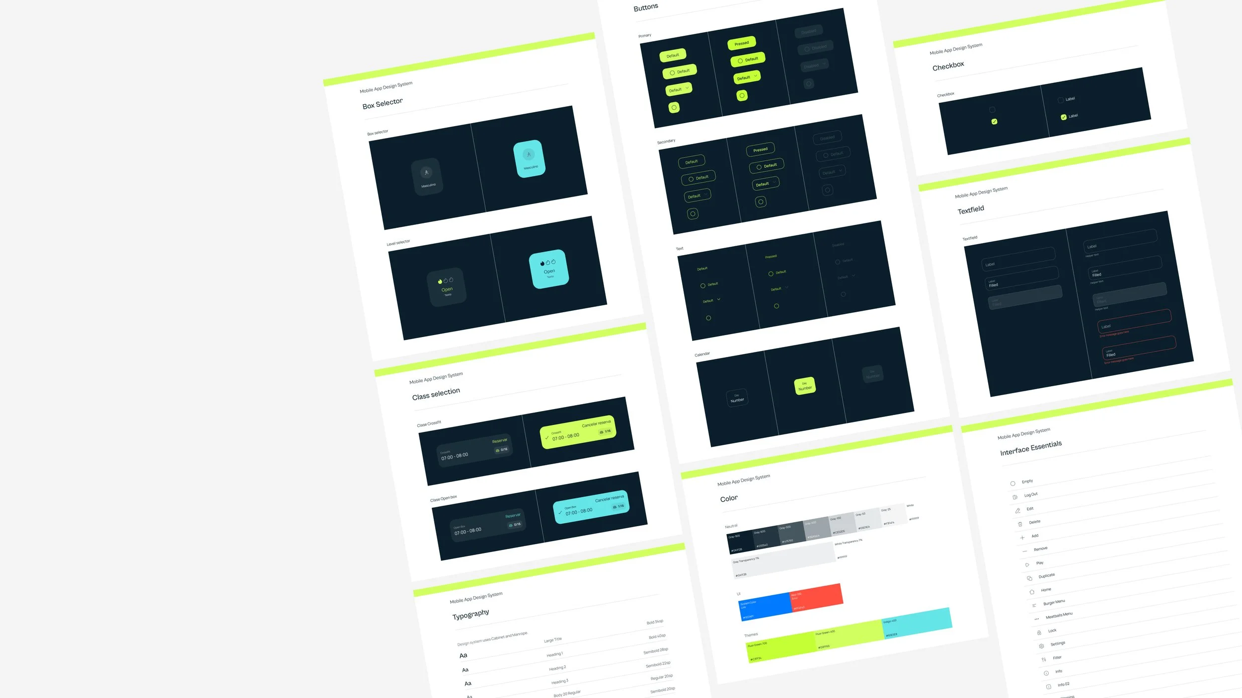
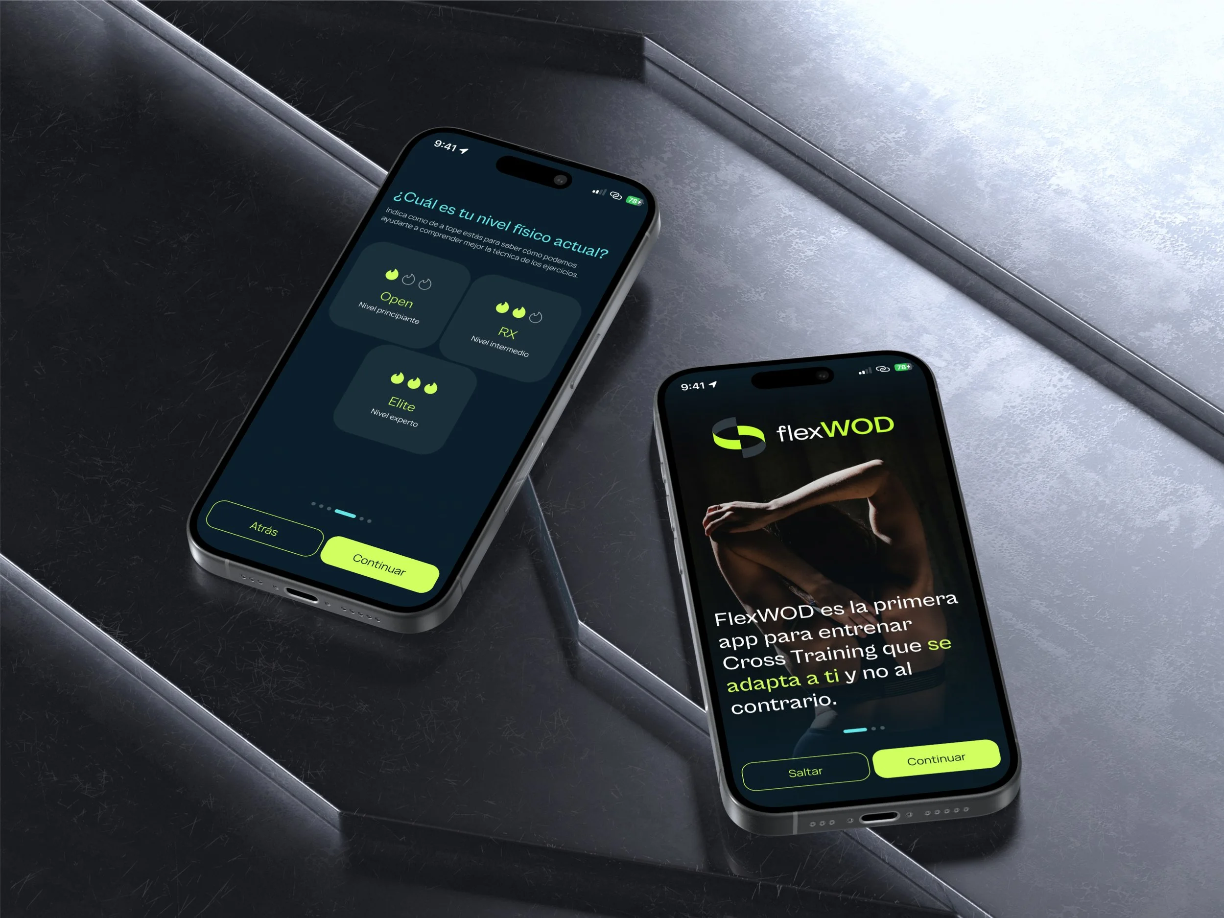
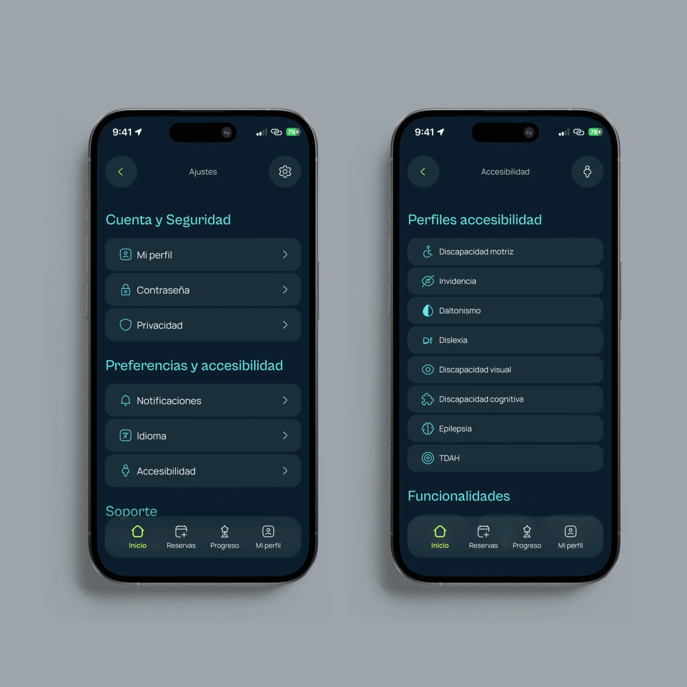
Built the brand from scratch: palette, typography, and a full Design System. Then designed the whole app: onboarding, profile setup, and every main and secondary screen, and connected it all into a navigable high-fidelity prototype in Figma.
(04) Evaluation
First a heuristic pass, then real user tests with a diverse group of participants. I watched where they got stuck, listened to what confused them, and went back to fix it. Not a checklist, an actual back-and-forth between observations and design decisions.

Benchmark
I looked at the main apps people use to manage their CrossFit training, covering everything from workout generation and performance tracking to class management and community. Technically, most of them work. The problem is none of them know anything about the person using them.
THE GAP
No WOD adaptation. No injury flags. No accessibility. Every app assumed a standard user.
FlexWOD was built for everyone else.
User survey
Most important features in an accessible CrossFit app
People weren't asking for anything exotic. Videos to understand the movements, workouts that adapt to their level, and a way to track progress. The basics, done properly, for everyone.
Challenges experienced with existing sports apps
The biggest frustration wasn't technical. It was that apps didn't adapt. Over half of respondents struggled with lack of personalisation, and nearly as many with navigation that just didn't make sense. The content was there, the experience wasn't built for them.
Jobs to be done
The surveys told me what people wanted. The JTBDs helped me understand why, what they were actually trying to accomplish, and what was getting in the way.
(01) Train without having to think around your body
People with injuries or physical limitations spend a lot of mental energy just figuring out what they can do that day. They don't want to ask a coach before every session. They want an app that already knows.
(02) Know your numbers without keeping a spreadsheetaing
RMs and progress across sessions shouldn't require a notebook or a third-party app. Athletes want that data in one place, and they want the app to actually use it to set their weights.
(03) Feel part of the community, not separate from it
The social side of CrossFit is a big part of why people show up. But if the app doesn't support that for everyone, regardless of ability, it's quietly excluding the people who might need that motivation most.
Design decisions
-
I didn't treat accessibility as a phase at the end. It was there from the first sketch. High contrast, large touch targets, scalable text. Not because a checklist said so, but because the whole point of the project falls apart if it doesn't work for everyone.
-
A lot of apps feel inaccessible not because of the visuals, but because you're never quite sure what just happened. Did that tap register? Where did I end up? FlexWOD needed to answer those questions before users had to ask them.
-
Short flows matter more when certain interactions are physically demanding. I kept asking: what's the minimum number of steps to get here? And then tried to get it lower.


User testing
I tested the prototype with a group of people that reflected the actual target users — including people with disabilities and older adults. Each session had two tasks. I watched, took notes, and asked questions at the end. No scripts, just real people using the app.
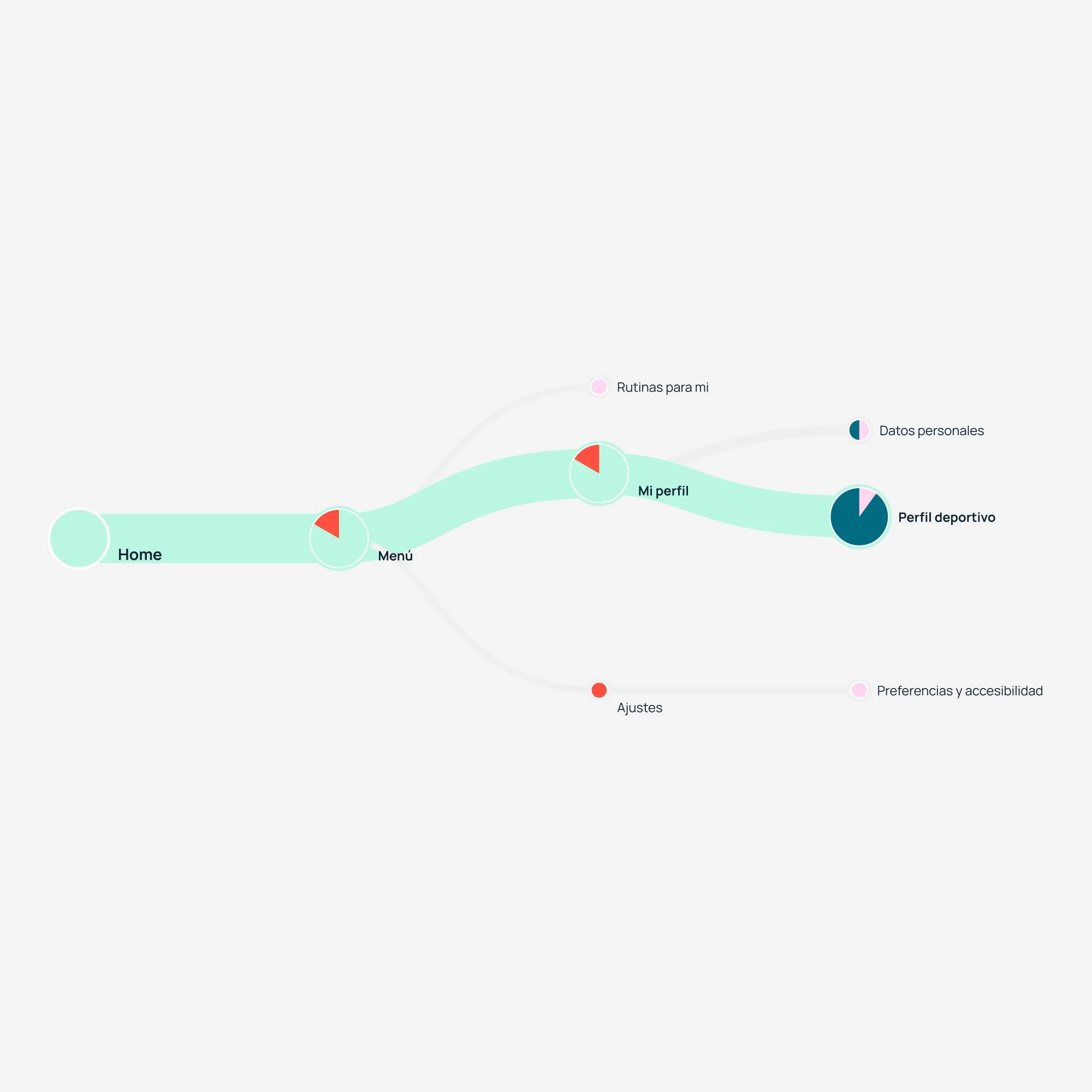
Adding an injury to the profile
Most people found it without help. A few got there by a different route, which was interesting — it told me the path wasn't as obvious as I thought. I added a direct link from the WOD screen to the injury settings so users didn't have to go looking.
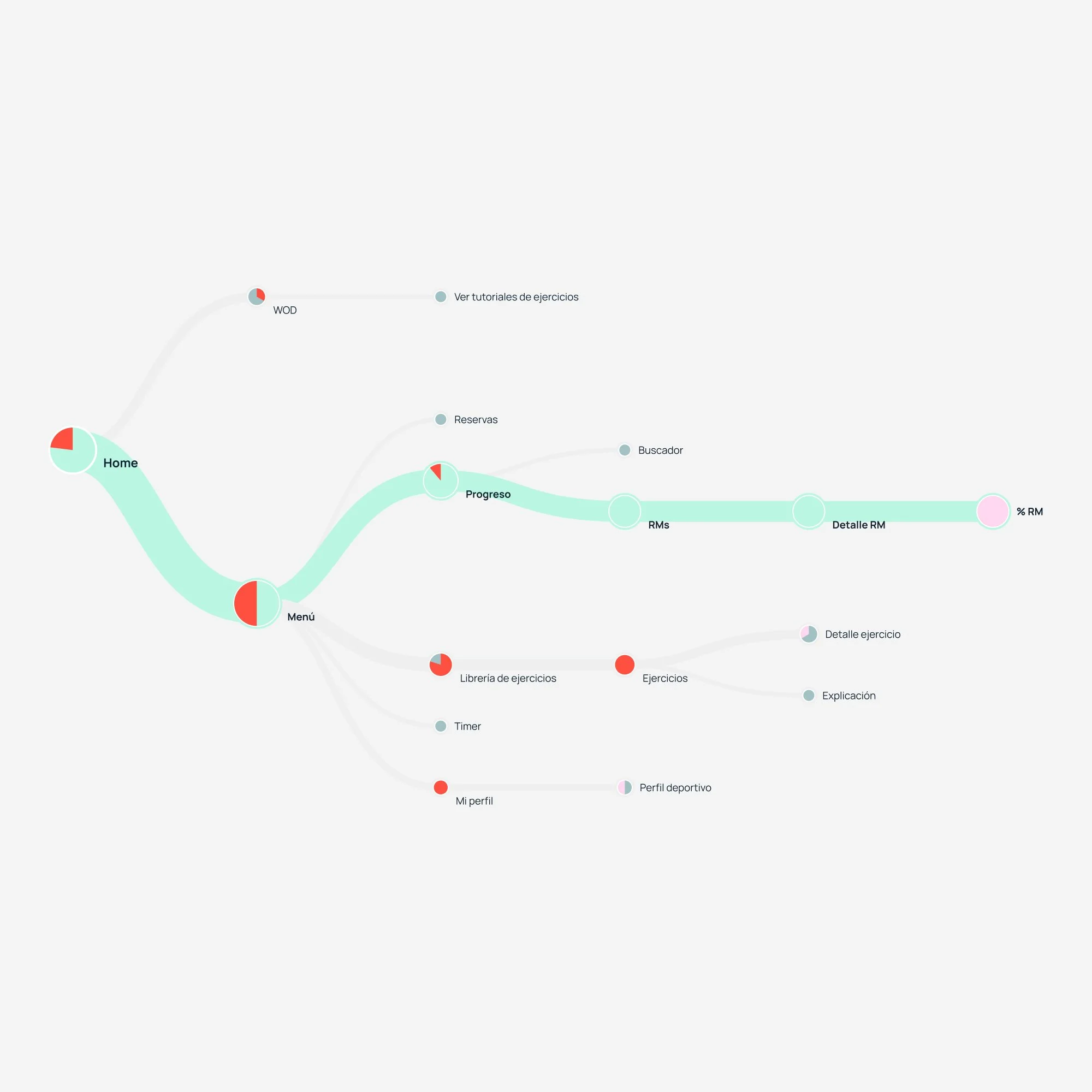
Finding the RM for an exercise
A bit more scattered than the first task. Some users went straight to the exercise library instead of the profile, which made sense from their perspective — if you're thinking about an exercise, that's where you look. It pushed me to surface RM data directly on the WOD screen, where the question actually comes up.
Conclusion
x
Learnings
x
Learning 1
a
Learning 2
a
Learning 3
a